Tessellate
Hi Everyone,
It has been quite a few months since I've posted something new on Dribbble. In the first half of this year I had the opportunity to collaborate with RocketTheme on the design of two new Joomla templates. It was a fantastic opportunity to go back to my routes, and take a small break from the very UX focused projects I'm mostly involved with these days. Designing templates can also be a lot of fun as you have a lot of creative freedom to go mad (in a very artistic kind of way), to explore different ahestetical approaches that would be difficult to pursue in other types of projects with very specific goals and targets (ex: Web Applications, which is where my heart is).
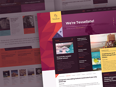
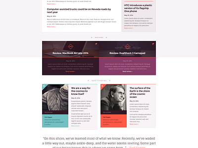
The second template is called Tessellate, and it was clear that this time we would follow a content oriented layout, to be easily adopted by a website heavy on news and articles. In this example in particular, we decided to follow an artistic direction as well, while maintaining the core objective of keeping a structure that would feel natural and unique. A few Pink Floyd albums later and the result is a layout with a great harmony between each section while making use of typographic weight to break sections and produce some contrast with the ultimate goal of enriching content.
I hope you enjoy this different than usual, yet very fun project I'm presenting this time. You can also take a look the RocketTheme website for more templates, they're currently working on some very nice projects, including a Flat-File CMS called Grav.
Please make sure you check out @2x preview and the attachment.
Note: All the photos used in this work were only used for demonstration purposes on my Dribbble page.
Superfamous, Unsplash.
Attachments:
tessellate_preview.png
tessellate_preview_144dpi.png
tessellate2_preview.png
tessellate2_preview_144dpi.png


