Project List Overview
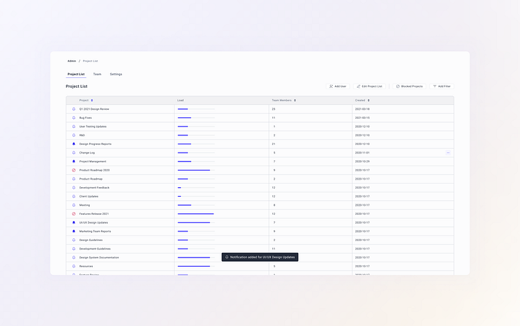
Here's a quick snippet of the latest project where it was needed to simultaneously tackle a couple of issues: add a quick filter that would allow showing only blocked projects, add users to a project, edit the project list and its properties, show projects' load, and add notifications for projects in a click.
The best way to do that according to research and testing is to organize the information in a lightweight table with clickable elements for adding or removing notifications, and showing the load as a progress bar that visually represents how loaded the project is. This way admins can grasp all the needed information at a glance and easily work with it.
Quick filter is just a click way so that admins can quickly get the desired results. To improve the user experience and make it even more seamless, graphical markers were added as a first column of a table that allows to see the blocked projects and to create a visual distinction between projects with notifications and without them. To ensure that the user is able to see the difference between such types of instances, contrasting colors and specific icons were chosen, so that every user can leverage the product's features.
For quick actions, such as adding notifications, removing them, or blocking projects notifications were added. This way, the whole user experience is smooth and seamless, while the user is getting all the important information at a glance and can easily manipulate it.
