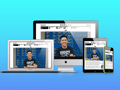
Breaks Magazine | Re-design
My proudest work to date, the complete re-design of Breaks Magazine. What used to be a quarterly release of articles, much like an actual magazine (the difference is it's only online), has turned into a weekly release of articles. The concept was to keep readers interested in in-depth and super interesting articles still, but not be too much like a 'blog'. I designed the concept of tagging colours to each section, amazing fluorescent ones at that, and three innovative ways to get around the site via a pull-out menu, a pull-down menu and swipe along menu. Have a look for yourself: http://breaksmag.com
More by Louis Buck View profile
Like
