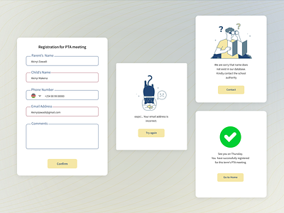
An error modal for a school in Kenya
The error modal shows the importance of relating with users in clear languages that can be easily understood. Also, it shows the importance of using visuals to pass across information.
As designers, always remember that you are dealing with human beings and not robots. Be kind enough to guide them and show them places where they've made errors.
I found an article that explains more on this. If you're interested, you can read it here
Press 'L" to like. I am open to work on your next project with you. Reach out to me via email leramograce85@gmail.com .Thanks
More by Grace Leramo View profile
Like
