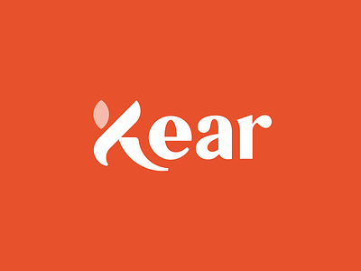
Logotype design for the Kear tea company.
The main idea of the logo is based on the type design so that the letter K in the name can also be read like the letter T with a slight slant. Thus, in the name of the company we see the word "tea", which is directly related to the activities of the brand.
Interested in interaction? Let's discuss your proposal: hello@durbailov.com
More by Maxim Durbailov View profile
Like
