Monk-ID - Logo Design / Refined Concept 🔼
MONK-ID - Logo Concept Refined 🔼
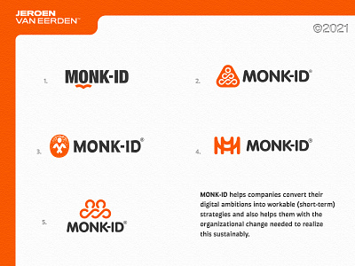
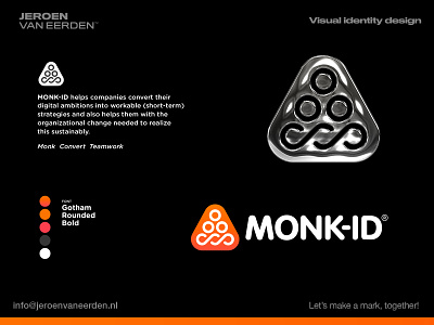
MONK-ID helps companies convert their digital ambitions into workable (short-term) strategies and also helps them with the organizational change needed to realize this sustainably.
I needed to refine this concept as the previous one (see back some posts ago) reminded me too much of a 💩 icon. Something which obviously isn’t preferred when designing a good-looking logo. 😆
What do you think of this subtle refinement? I like the fact all elements are somehow in here while still not making things too complicated or forced. Feel free to share your feedback on the comments 🙃
Have a great new week everyone! ✌🏻
🧡𝐈𝐧𝐭𝐞𝐫𝐞𝐬𝐭𝐞𝐝 𝐢𝐧 𝐰𝐨𝐫𝐤𝐢𝐧𝐠 𝐰𝐢𝐭𝐡 𝐦𝐞?
Feel free to reach out via DM or by email:
👉 info@jeroenvaneerden.nl