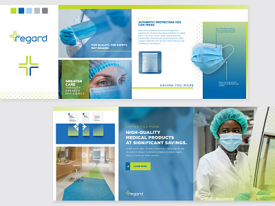
Medical Stylescape
Regard was in need of a new look for their medical product catalog and PowerPoint materials so we started with a stylescape to get a feel for what represented them well. A blurred glass effect was used for text backgrounds as well as gradients and a pattern based on their logo to complete the look. Thank you to Regard and Hardy Design Co for this opportunity. Art Direction: Mike Hardy
More by Sheri Kowalski View profile
Like

