REDESIGN – Wema Bank success page • V1
There's alway been this itch I get to redesign a lot of applications I use which I feel are lacking in areas like accessibility, proper color application, typography, basically most of design principles. I just want to try and make a meaningful contribution with the little knowledge I managed to accumulate over the years.
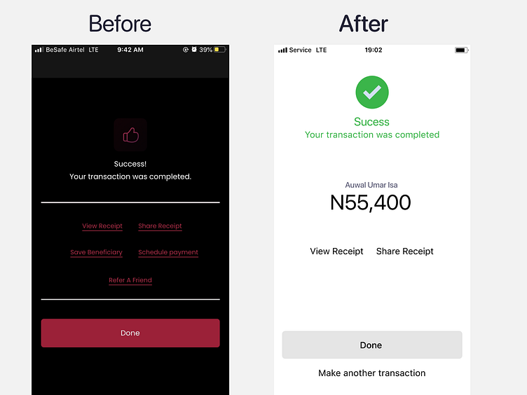
V1
This iteration of the redesign aims to get rid of the clutter and focus only on little bit of accessibility, content prioritisation and hierarchy that I feel is relevant to be on a success page.
I also got rid of some of the buttons seen in the mid-section, which I plan on putting on the page that deserves it the most.
UPCOMING - V2
I plan on apply the brand colors where needed and also deliver the app both color modes (light and dark)
I would really love to hear your feedback on the overall design
