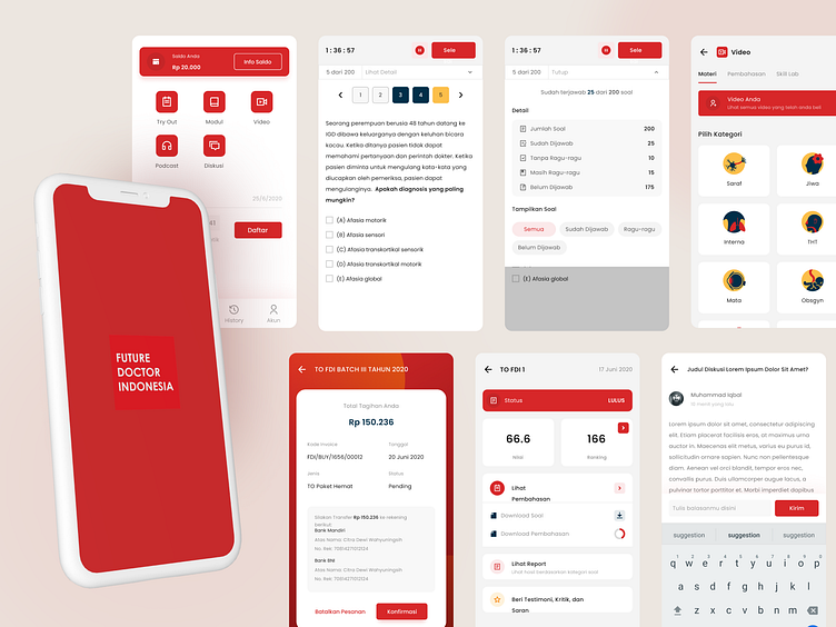
Online Learning Platform for Medical Student
Hi Dribbblers 🏀
In this shot, I want to share a project that I completed in mid-2020.
== 👤 Client ==
FDI is an exam preparation platform for medical students before they become doctors. With this platform they can learn through videos and practice questions. Learning materials that have been purchased according to the exam period can be accessed on the dashboard. Through the dashboard, users can also answer questions, view scores, and review their answers. FDI can be accessed through the website or mobile application (currently android).
== 💡 Challenge ==
The FDI website was already operational previously. However, as FDI products and services continue to grow over time, FDI requires a new design that can accommodate its products and services so that users can use them easily. In addition, the previous design looks messy and disorganized from a brand standpoint. Also, I found some UX issues that interfere with User Flow.
== 🧠 Solutions ==
First, I need to create an easy User Flow to access all products and services. Then I revitalized the whole design from atomic to complex parts. In order to maintain brand consistency, I created a design based on the style guide that I set earlier. Finally, iterations are continuously carried out to ensure the user can use it easily.
== 📱 Service ==
I am responsible for designing the website, dashboard, and mobile application for this project.
== 🗓 Year ==
2020
Behance | 👉 Check it Live Here 👈
==================
Have an amazing project?
You can reach me at nuhamlnahsan@gmail.com
