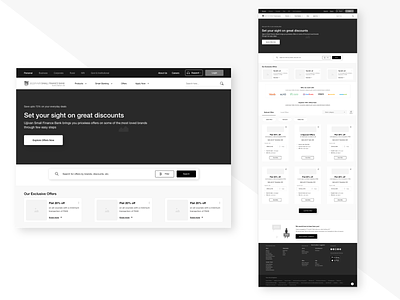
Offers Wireframe

The requirement here was to redesign the Offers page of a Small Finance Bank giving into a modern and user-friendly interface.
We created high-fidelity wireframes by keep usability at the centre of focus. Besides this, one of our primary goals was to ensure that the redesigned interface fits in seamlessly with the original interface and does not break any links or other functionality of the product.
During the process, we realised that some noteworthy user experience changes were needed such as:
Eliminating banner blindness caused by the overwhelming amount of carousels in the first fold.
Adding filter categories, tags and tabular menus that narrow down content while helping surface the most relevant results to the users.
Ensuring simplicity, visual hierarchy, actionable CTAs and clear value propositions.
Facilitating user search intent.
Highlighting time bound and trending offers.
Content layout that enables user to skim through the interface easily.
The main challenge was to avoid changes that were too radical, holding the ability to confuse and frustrate the product’s existing users. Hence, we used the existing components wherever possible.
Please feel free to share your thoughts or feedback.