Menu Tryout
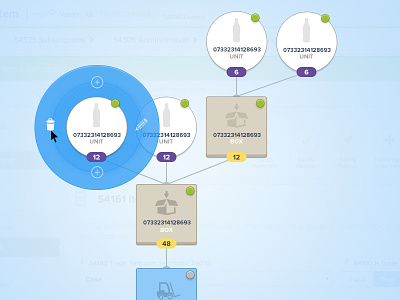
Trying out some solutions for a contextual menu. This is a product hierarchy that can get really really big ... This is far from final... just to know what you guys think of this solution.
Check the attached file for updated screenshot: https://dribbble.com/shots/1694064-Menu-Tryout/attachments/269470
The 2 "add" icons are correct, because we can add a upper level item or a lower level item, so we can go both ways.
The green and gray circle icons, are to show if the item is published or pending.
The counter is to show how many "units" are needed to create a box for example.
More by Pedro Sombreireiro View profile
Like

