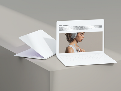
Minimalistic design + information overflow
Hey Everyone! 👋🏽
This is post 2 of 3 about our project with LORA - the modern dentist chain in Germany. For more information about LORA check out post 1.
Working with LORA was great fun because of their attention to detail and their minimalistic approach. One of the big hurdles was getting quite a complex concept, which differs in so many ways from traditional dental clinics, onto a single landing page without being overwhelming to its users. See for yourself whether it succeeded at https://www.heylora.com/ 👀
🤍 Don't miss the next shot, Follow on Dribbble!
More by Ben Schröder View profile
Like
