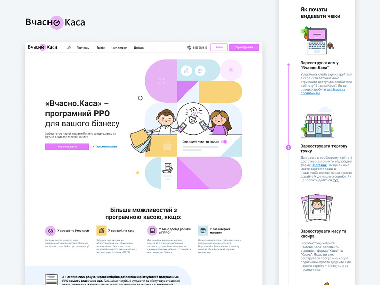
Landing Page
The Vchasno.Kasa product page design
Hello Dribbblers, Presenting a New modern landing page design for Vchasno.Kasa
I try to make it clean by using white space and interesting illustrations. Please share your feedback about the color choice and placement of the elements.
If you like what you see, don't forget the press the ❤️ icon and follow me Dribbble and other social platforms to get exciting content and tips.
So make sure you follow me on Dribbble too. Still not following me on Instagram? Here is the link to make your day better @kasia_illustration
Connect With Me On LinkedIn: @kateryna-fedorenko
More by 🇺🇦 Kateryna Fedorenko 🇺🇦 View profile
Like
