Corporate Training Program


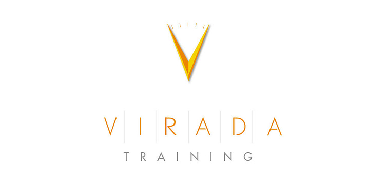


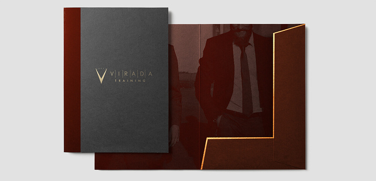


Virada Training had a unique problem they needed to clearly describe the core value proposition of their business as an effective sales training center.
This logo design concept focused on the company’s ability to create significant results for the sales team by leveraging their most valuable asset, time.
The primary element focuses on time and how the process cannot be shortcut.
By doing things the right action at the right time, it's what creates the most leverage.
Viradas clientele mostly comprise sales directors engaging with staff who are constantly out in the field.
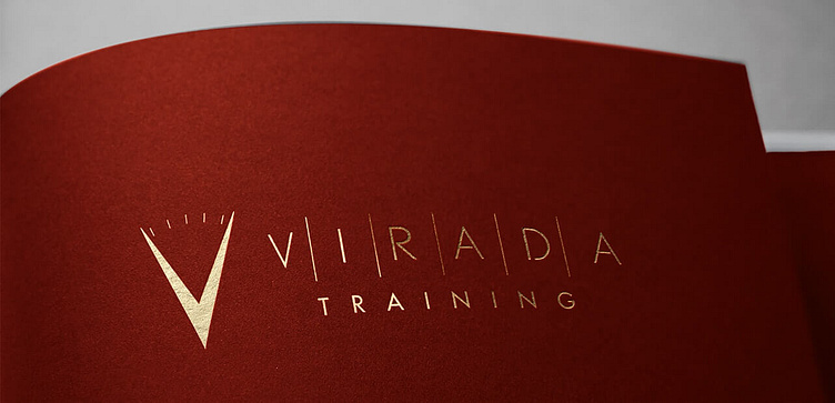
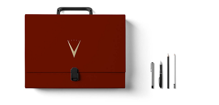
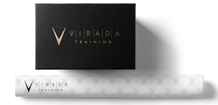
The logomark features the hands of a clock and doubles as the letter V with notches that represent steady progression.
The colors of Gold and Canary work as a primary palette.
And Garnet Red supports the professional standards of quality.
With C-Suite sales executives, Star Black adds the right touch of panache for training sessions requiring a higher level of attention.
The font, Futura Light because, makes for sleek structures, angular 90-degree corners, and almost perfect circles.
Its shapes command respect in the simplest of ways without being to flamboyant that you might expect from a more common approach such as a script font.
It took a simple corporate structure into consideration with the overall tone.
Vertical strokes as dividers also helped to create a pace and sell the cadence that remains consistent throughout the brand.
Virada Training had a unique problem they needed to clearly describe the core value proposition of their business as an effective sales training center.
This logo design concept focused on the company’s ability to create significant results for the sales team by leveraging their most valuable asset, time.
The primary element focuses on time and how the process cannot be shortcut.
By doing things the right action at the right time, it's what creates the most leverage.
Viradas clientele mostly comprise sales directors engaging with staff who are constantly out in the field.
The logomark features the hands of a clock and doubles as the letter V with notches that represent steady progression.
The colors of Gold and Canary work as a primary palette.
And Garnet Red supports the professional standards of quality.
With C-Suite sales executives, Star Black adds the right touch of panache for training sessions requiring a higher level of attention.
The font, Futura Light because, makes for sleek structures, angular 90-degree corners, and almost perfect circles.
Its shapes command respect in the simplest of ways without being to flamboyant that you might expect from a more common approach such as a script font.
It took a simple corporate structure into consideration with the overall tone.
Vertical strokes as dividers also helped to create a pace and sell the cadence that remains consistent throughout the brand.
