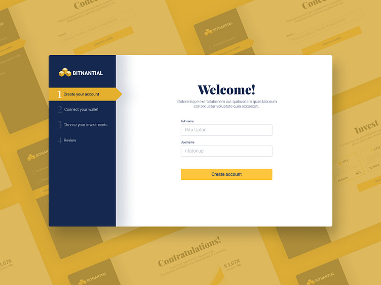
Daily UI Challenge :: 023 - Onboarding
Nice! I was pointing to a really clear UI and I think I nailed. It was so fast, I was able to make 3 more screens.
Even so, I was not able to contain myself to add a couple of shadows. Also, I think the yellow color should look more gold like, but it's fine this way.
#DailyUI #023
More by Daniel Pescador View profile
Like
