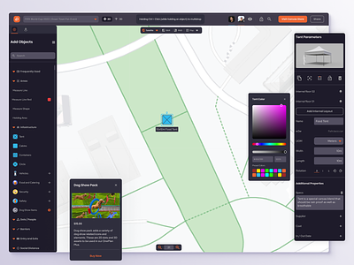
OnePlan - Studio View
This design is pretty close to the final design we landed on. We landed on this Dark Theme that allowed us to use their brand color as interactive and primary bits of UI. We're showing a few key interactions here. How elements look when placed on the 2D map and how we can display a settings panel that shows what the 3D object looks like. The different customization elements for those placed objects, and finally upsell opportunities for different asset packs. Users will grab objects from the left inventory and drag them out onto the map which places them into their plan. They can customize different parameters for each object and really plan out their entire event in this top-down view. Check out OnePlan
More by Headway View profile
Like
