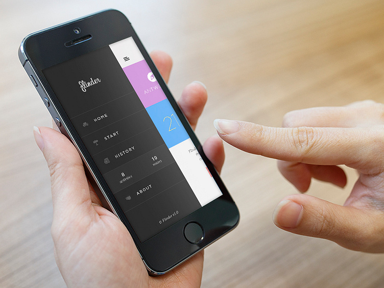
Flinder menu
As said in my previous shot, I'm working on a mobile app called "Flinder". This screen is what happens when you press on the hamburger icon and the menu slides in from the left (obviously).
The reason the menu itself is designed in greyscale is because all the other pages on the app use a lot of color.
Looking forward to hearing some comments! - J
EDIT: Flinder is now live! Download it on the appstore → www.flinderapp.com
More by Jan Van Echelpoel View profile
Like
