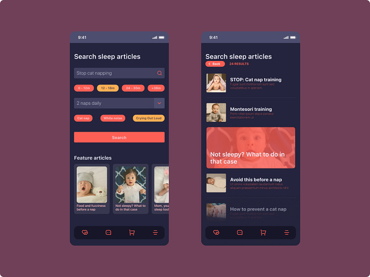
Daily UI Challenge :: 022 - Search
Clean and spacious. In the initial designs, all the elements were too close to each other. Added some extra space and deleted a couple of elements to make it look better.
The background seems to be the only thing that didn't match. lol.
#DailyUI #022
More by Daniel Pescador View profile
Like
