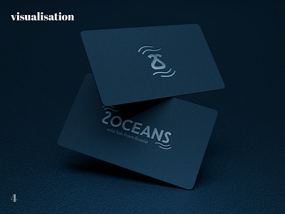
2 OCEANS logo
Difficulties:
Despite the fact that 2 was highlighted in color, the client wanted the number to be even more separated from the letters of the logo so that it could be read immediately. Therefore, we decided to make 2 slightly larger.
The brand name at first consisted of signs standing slightly apart from each other. Then it was decided to combine it into one sign, so that it more resembled not swans, but the tail of a sea fish. It turned out to be a more original and memorable sign. Otherwise, the client liked everything and the logo was accepted.
🖤 Let's work together — hello@xeniaskazka.ru
Follow me: Instagram
Please support my first case) 🖤
Kseniia Kudrina / graphic designer / corporate identity / company design support (Finland / Suomi)
Get in touch
More by Kseniia Kudrina / graphic designer / corporate identity / company design support (Finland / Suomi) View profile
Like
