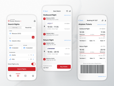
Flight Booking App | iOS Concept
Hello, dribbblers!
⠀
I present a rather minimalistic concept of a flight booking app, inspired by the feeling of flying among the clouds.
⠀
Red was chosen as a contrasting color and I had a particular personal reason for that — it's believed that red is associated with error and might be confusing for users. However, I'm in love with this color, so I wanted to try to make a concept where the red would look confident and less terrifying.
⠀
So, how does it look? :)
⠀
— Valeria Lyzlova
November, 2021.
More by Valeria Lyzlova View profile
Like
