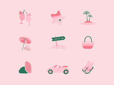
Summer Icon Set for Bare August
A super fun, feminine and summerish icon set we designed for Bare August.
Bare August is a foot care brand that gives busy women the sole sisters they’ve been looking for, with foot-care essentials for smooth skin and that summertime, girlfriend’s getaway feeling all year long.
Savoring summer is the main inspiration at Bare August. They wanted their foot-care essentials to feel like a summer spa retreat, not a trip to the doctor’s office. So they sourced natural ingredients and innovative designs to create an at-home pedicure system, all wrapped up with an air of the best month of summer — no matter where you are or what time of year.
We were lucky enough to design their extremely cute and fun brand identity system which starts with a palm logo mark, the symbol of a summer vacay. We designed a modern vintage feminine logotype and picked a classy, luxurious font system, combined with an elevated summer palette and monochromatic vintage-classic illustrations.
RESULTS
The visual identity was key to their huge success on Amazon and their recent features in BuzzFeed, Elite Daily, The Skimm, Shape, and Dieline.
SERVICES
Brand Design / Packaging / Iconography /
Illustration / Website direction
CREDITS
Brand Messaging - Required Reading
Product Photos - Eryn Shea Photography
