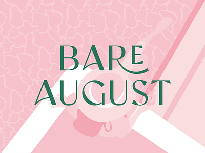
Bare August Brand Identity
Bare August is a foot care brand that gives busy women the sole sisters they’ve been looking for, with foot-care essentials for smooth skin and that summertime, girlfriend’s getaway feeling all year long.
Savoring summer is the main inspiration at Bare August. They wanted their foot-care essentials to feel like a summer spa retreat, not a trip to the doctor’s office. So they sourced natural ingredients and innovative designs to create an at-home pedicure system, all wrapped up with an air of the best month of summer — no matter where you are or what time of year.
We were lucky enough to design their extremely cute and fun brand identity system which starts with a palm logo mark, the symbol of a summer vacay. We designed a modern vintage feminine logotype and picked a classy, luxurious font system, combined with an elevated summer palette and monochromatic vintage-classic illustrations.
This project was the perfect opportunity to play with the hand-written font Palm Canyon Drive designed by the talented boss women at Hoodzpah.
RESULTS
The visual identity was key to their huge success on Amazon and their recent features in BuzzFeed, Elite Daily, The Skimm, Shape, and Dieline.
SERVICES
Brand Design / Packaging / Iconography /
Illustration / Website direction
CREDITS
Brand Messaging - Required Reading
Product Photos - Eryn Shea Photography


