2 OCEANS logo
Process:
Picked up a mood board from photos suitable for mood, idea and color scheme.
Started with a sketch of the logo idea: in the center is the text name 2OCEANS, along the edges I outlined places for the graphic designation of the ocean. The logo is based on the idea of a graphic designation of two oceans in which fishing takes place: the North Atlantic and the Pacific. Geographically, they are located diagonally from each other; top left and bottom right.
Noticed that the number 2 and the letter S are similar and mirror each other. I decided to highlight the symmetry of the logo with similar signs around the edges. I picked up a suitable font and modified it. I also modified the sign so that it looks like both 2 and S.
Next, I drew graphic elements in the form of waves arranged diagonally.
Picked up the color scheme: the main color of the sea is dark blue and the accent ice blue, which is associated with the northern seas. I used flowers from the mood board.
I have selected suitable minimalistic, strict and modern fonts for headings and for typesetting.
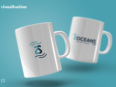
Made a shortened version of the logo - I connected 2 signs 2 and S together and added waves along the edges. An abbreviated version is needed for round formats, as a decorative element (for example, a background on a letterhead) or for a favicon.
Picked up a uniform photo background in view of the seething northern ocean with foam, in branded colors. It will be used for presentations, website, and for some layouts, mostly in digital form and reflects the mood of the 2OCEANS brand.
Made several mockups, visualizations of the logo so that the client could see how his logo would look in real life. I chose for this a patch on an employee's T-shirt, a branded pen, a branded mug from which both office workers and real sailors can drink. As well as a screensaver for the phone and expensive business cards for the management.
-
Designed all the materials into a stylish presentation, which spelled out the presentation of the brand and a guide to corporate identity.
🖤 Let's work together — hello@xeniaskazka.ru
Follow me: Instagram
Please support my first case) 🖤
