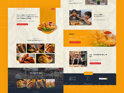
Japanese Fried Chicken Landing Page
Hello guys! 😎👋
This time I will share a website design that I have created. Chicken Oishi is a dummy shop that sells a variety of fried chicken in Japan. I use a lot of orange and red, in addition to making it look more attractive. I want visitors to feel more hungry and not hesitate to buy fried chicken directly at this shop. 🛒 🍗
Hope you enjoy it! 🥳
#uidesign #uiuxdesign #webdesign #landingpage #ui #ux #webstore #onlinestore
More by Aji Kesuma Negara View profile
Like
