Too Minimal Instagram

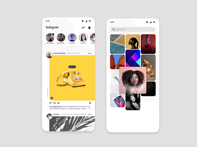
My third day of learning Figma. I have tried to use the layout grid and color styles features.
I really love the feed design as a concept. I'm not sure if it's actually better compared to more mainstream layout since it took a lot of whitespace from the left side and it just felt empty. To compensate the emptiness, I put the posting date there however as a vertical text. Quite dangerous in terms of readability. That's why I like it as a concept.