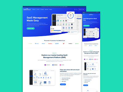
BetterCloud Homepage
The homepage features a clean design that highlights the key areas of BetterCloud’s product offering. The hero header features a staggered animation meant to capture the users attention and focus them in on the product. The design also makes it easier for users to navigate through and find exactly which service fits their needs. The homepage also features a scrolling list of current clients of BetterCloud to help build social proof.
View Full Case Study: https://huemor.rocks/case-studies/better-cloud/
More by Huemor 🚀 View profile
Like
