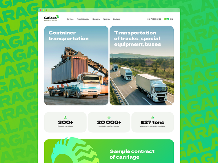
Website for a transport company
Hello, friends 👋
I made this website for a transport company about 3 years ago. The visual language of the project is simple: services and content come to the fore.
A bright but strict image emphasizes that the company is reliable and modern.
Large images, contrasting typography and a simple structure are the recipe for this layout. Now the site is working successfully and brings income to its owner.
Your feedback is very important to me, so I invite you to the comments, where I will answer any questions ❤️.
Have a good day!
More by UX PIX View profile
Like
