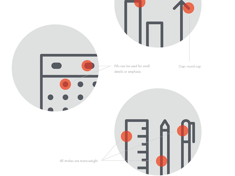
Iconography construction
Detail from the brand usage guidelines we created with Berger & Föhr.
The new Percolate family icons are consistent in style. Visual cohesiveness is achieved in the following manner; all corners should have a round join, all strokes should have a round cap, the icons should be primarily stroked with some highlight/detail fills, and all of the strokes should be mono-weight.
Read more about the project here: http://blog.percolate.com/2013/11/introducing-the-new-percolate-brand-system/
More by Percolate Design View profile
Like
