Invitees Modal
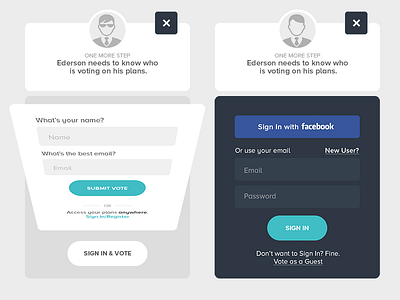
The Best Day noticed a huge of number of invitees dropping the page when asked to input their names and emails to confirm their votes. One of the reasons was because the modal looked like a sign in form and users didn't want to do so. It wasn't clear they could vote as a guest.
The solution involved a complete overhaul. The new design made it clearer there was two ways to confirm the votes: as a guest or signing in.
More by Ederson Morche View profile
Like

