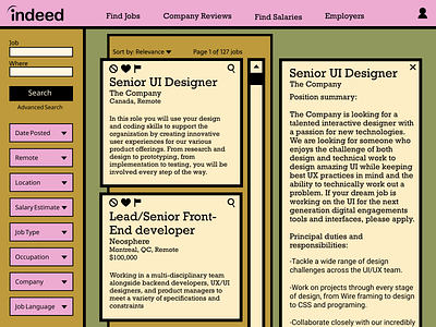
Daily UI #050: Job Listing
For this project I wanted to do something colourful where most sites like Indeed keep things very basic, so I did a redesign of the Indeed job search platform. I was tempted to use a lot more colour, but since it's so graphic and bold I decided to use more restraint so users wouldn't feel fatigued by looking at a lot of colour while on their job search. Looking for a job is a drag for everyone, I feel if the interface is more pleasing and interesting to look at, it takes a little bit of the edge off and injects a bit more optimism, at least that's my goal.
More by Lisa Lavin View profile
Like
