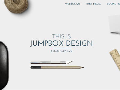
Portfolio Redesign
It's been a couple of years since I updated my portfolio and some things have changed since then. I've now teamed up with a good friend of mine @Kris Jones, to offer a better, more comprehensive service which means the "One Man Design Studio" slogan has to go.
Therefore there is no better time for a rebrand and a refresh of the website overall. This is a rough version and isn't pixel perfect yet by any stretch of the imagination but shows the direction we are going.
We wanted to keep the same simplicity regarding the colour scheme (greys with one accent colour - see Jumpbox Design) but give it a more professional approach.
As always comments are welcomed, they can only make it better!
More by Lee Thomas View profile
Like

