GAELO Logo Design
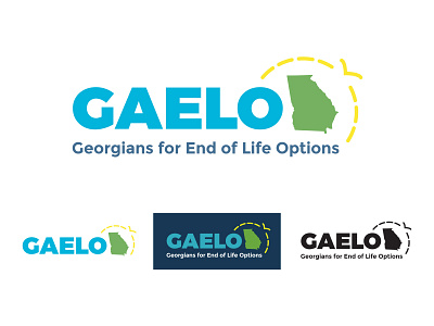
GAELO, Georgians for End of Life Options (gaelo.org), is an organization focused on advocacy and education surrounding the preparations and choices that need to be made at the end of someone's life. Not only do they advocate for the right of people with terminal illnesses to end their life on their terms but they also help educate and assist people in planning many of the issues surrounding the final chapter of life. It's a heavy topic to be sure and one that is easy for people to ignore or turn away from. The challenge with creating a new logo and brand for this organization, was to create something that looked very serious and professional, but not heavy or scary. We needed something a bit warmer, lighter and friendlier and - if we were lucky - helped the audience see a bit of optimism in it. We new we wanted the prominent parts of the logo to be the shape of the state of Georgia as well as the acronym (GAELO) so we went big a bold with those in some very warm colors and then added what we considered a setting sun around the shape of the state. The "sun" was rendered with a dashed line and we turned one of the dashes into a bird shape to show it flying away - a nod of course, to someone moving on to whatever lies ahead.
You can see in the examples the main, full color logo as well as the options of what the logo looks like when it's just the acronym, against a dark background, or one solid color. Additionally, I created a version of the logo to use in social media profile pics that is locked up into a square and uses just the acronym.
Stay tuned for their new website which is currently under development!


