Prospective Page
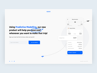
Here's one of several iterations for a flight app redesign.
I was asked to redesign the coming soon page for a flight app, that helps predicts when flights will be cheapest and ultimately helps people save cost.
I used the primary color blue on the text to best highlight how the product works and also highlight how it can help users.
Also, by bringing out the "cheapest price" frame, it also emphasizes what the product does for users and its main aim, which is to save cost.
More by Fatogun Femisola View profile
Like
