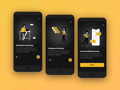
Spacebar App | Onboarding Dark Theme
Presenting, onboarding of Spacebar app in all new dark theme.
While designing the app for smaller devices, I thought of trying out dark theme for fun and it turned out to be surprising.😍
Why design for smaller devices?
For users to be able to use your app on any device in any context, your design needs to be adaptive. Most of the modern phones have an aspect ratio of 19.5:9, meanwhile there are users of older phones like iPhone 8, SE and other smaller android devices which have an aspect ratio of 16:9. It is essential for us to make the product accessible to everyone.
Designed in Adobe XD
---
Connect with me on LinkedIn | Twitter
Thank you! ✌
More by Akarsh Kumar View profile
Like

