Banking App
Take a look at our new shot — banking app 💰
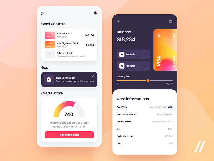
⬅️ On the left screen, you see that dashboard where the user can: 💳 see the cards and make transactions; 🎯 add a goal and save up money; 📊 see the credit score.
➡️ On the right screen, there is a card view. The user may make transfers, see the card data, and check the monthly limit if it's a credit one.
🟠 🔴 When choosing the color scheme, we thought about our target audience. We decided to make the design bright and used orange and red as accent colors.
Press 💜 if you like our design and share feedback!
// Made for Purrweb
More by Alena View profile
Like
