Woodville Group - WG Monogram Logo Design


Logo design concept B for Woodville Group.
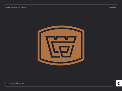
Our second concept is an emblem style logo designed to resemble a family crest, giving the impression of a long standing and prestigious company. The ‘WG’ monogram is emblazoned in the middle with the W as the primary letter, and G woven through the middle. Once again gold is used to give the company a premium feel, a little different to the usual construction business.