Grodsky • Modern Antiqua Family


Grodsky is solidly in the early 20th Century end of the Vintage Voyage spectrum. True to its studio’s name, this stately font suggests travel. Not today’s travel of long lines, searches, and blah service, but a time when travel meant suits and gowns, not shorts and backpacks. That’s because this high contrast Antiqua is smart and wordly, classy and reserved. It takes a ship from New York to France, never the discount flight. Its pronounced serifs, contrasting geometry, and elegant lines are along for the trip, perfect for your magazine and the titles within. An article about Margaret Dumont, perhaps. Grodsky’s interplay of right angles and flowing lines exude classiness from an earlier time, which makes it the perfect font for today’s magazines, advertisements, articles, headings or text, film titles and credits. The list has no end, but whatever your project, Grodsky will open doors.
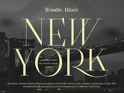
Grodsky is a modern high contrast Antiqua with well-defined, recognizable features. Based on the architecture of classic Antiqua fonts, Grodsky is typical of the typefaces from the first half of the 20th century: pronounced serifs, contrasting geometry, and an interplay of right angles and flowing lines.
Grodsky has a lot of stylistic alternates and ligatures and true small caps. They give you more authentically typographic style. Grodsky comes with oldstyle and modern, fraction and tabular figures. The font is well suited for both headlines and body text.
Grodsky comes in two weights and true Italics. Multilingual.
Enjoy!