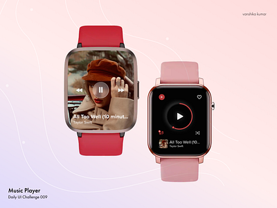
Daily UI #009 : Music Player
Instead of designing for the usual mobile and desktop screen, I decided to design for a smart watch instead. I eliminated the next and previous button because they can be achieved with physical gestures like swipe. I also made the progress bar circular to provide more freedom to go back and forth. This was a challenging task and helped me think more about the UX than the UI.
More by Vanshika Kumar View profile
Like
