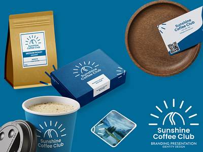
SUNSHINE COFFEE CLUB
BRIEF
“Sunshine Coffee Club” is a subscription-based coffee delivery service based in Vancouver, that offers customers new flavors of coffee every month.
Note: Note: “Sunshine Coffee Club” isn’t a real company. The brief is taken from an online community called “The Spot”, which offers monthly challenges, similar to this one.
CONCEPT
The logo represents a coffee bean, surrounded by sunrays. The “sun” is only half-visible, representing a sunrise, refering to the fact that coffee is commonly drank in the morning.
The color used, a dark blue, is visible on the flag on Vancouver and is meant to represent the surrounding ocean.
The font used, Poppins, fits the logotype. It’s simple, friendly and welcoming.
Alongside the coffee, they also bring customers custom-made mugs and coasters every month, which I also designed. The coaster is a simplified version of a Vancouver landscape, with part of the brand’s logo visible in a corner.
