CherryCrème Bakery
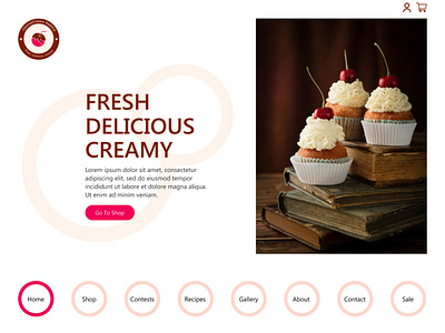
CherryCreme Bakery is a case study of using softer colours on a website.
Although, there are basic rectangular elements present in the design, I traded the regular navigation bar for circular buttons resembling those mouth-watering donuts. It also gives a softer look to the design.
Function:-
This website serves multiple purposes, such as a shop to buy the delightful baked goods, learn to bake them or participate in the contests and win exciting prizes. This design caters to the functions with a suitable design to match them.
See the whole design: https://www.behance.net/gallery/131216405/CherryCreme-Bakery-Web-Design
Work with me:
https://www.fiverr.com/kd_imagineria?up_rollout=true
Thanks!
More by Kaushiki Damle View profile
Like
