Alice's Adventure In Wonderland


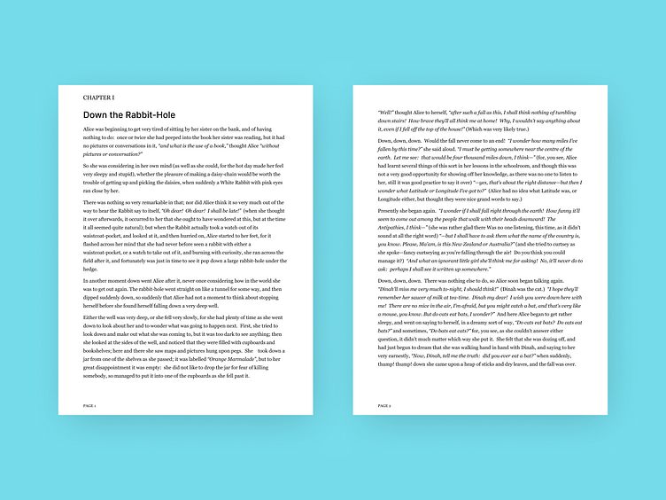


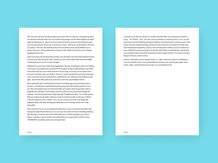

I designed an ebook version of Alice’s Adventure in Wonderland written by Lewis Carroll (sample ebook on Adobe). I used font pairing, it lets you pair typefaces in either san serif, serif, display, or script to improve readability. I learned about this technique in a master course at Alex’s design academy. It's really important for us designers to improve readability for our users by understanding their background of what type of fonts they encountered.
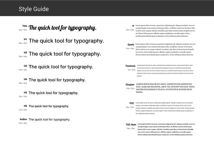
I designed an ebook version of Alice’s Adventure in Wonderland written by Lewis Carroll (sample ebook on Adobe). I used font pairing, it lets you pair typefaces in either san serif, serif, display, or script to improve readability. I learned about this technique in a master course at Alex’s design academy. It's really important for us designers to improve readability for our users by understanding their background of what type of fonts they encountered.
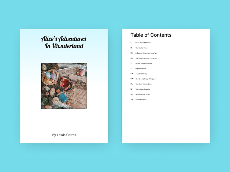
I designed an ebook version of Alice’s Adventure in Wonderland written by Lewis Carroll (sample ebook on Adobe). I used font pairing, it lets you pair typefaces in either san serif, serif, display, or script to improve readability. I learned about this technique in a master course at Alex’s design academy. It's really important for us designers to improve readability for our users by understanding their background of what type of fonts they encountered.
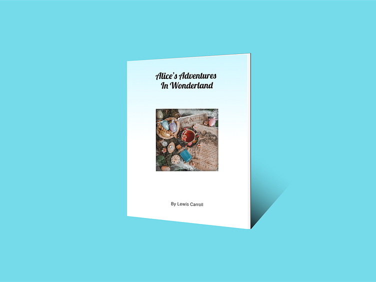
I designed an ebook version of Alice’s Adventure in Wonderland written by Lewis Carroll (sample ebook on Adobe). I used font pairing, it lets you pair typefaces in either san serif, serif, display, or script to improve readability. I learned about this technique in a master course at Alex’s design academy. It's really important for us designers to improve readability for our users by understanding their background of what type of fonts they encountered.
I designed an ebook version of Alice’s Adventure in Wonderland written by Lewis Carroll (sample ebook on Adobe). I used font pairing, it lets you pair typefaces in either san serif, serif, display, or script to improve readability. I learned about this technique in a master course at Alex’s design academy. It's really important for us designers to improve readability for our users by understanding their background of what type of fonts they encountered.
