Russian National Railway website redesign
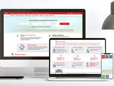
Project: redesign the Russian National Railway website according to good UI practices (done as a part of my UX/UI course at CONTENTED) and using another website for font reference (bbc.com for this task)
Current problems:
• Due to photos with a dark overlay over them used as background for different blocks, the design is overall heavy and dark.
• Colour scheme not always consistent with different tints of grey and red being used throughout the website. For example red is used both as active element colour (buttons, links) and for secondary things like the date on the news section.
• Similar information blocks are hard to quickly scan through - no clear hierarchy, titles are not always clearly readable over the photos.
• Navigation repeating itself in neighbouring blocks, but at the same time looking different
Suggested improvements:
• Break the grid layout a bit in order to create more space and readability
• Consistent colour scheme
• Use of icons to enable the user quickly recognise relevant information blocks
• Combine the blocks with similar information, like booking new and checking existing tickets
• Login/ registration area combined and made more clear and visible