"Pops" lettering (WIP)
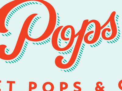
Here is an update on the lettering we have presented within a logo for a client. Added a diagonally-lined drop shadow to make it not seem so dark all together. We also made the colors brighter and more friendly.
Here is an update on the lettering we have presented within a logo for a client. Added a diagonally-lined drop shadow to make it not seem so dark all together. We also made the colors brighter and more friendly.