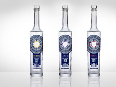
Bromil: fruit spirit label series
The main condition of the design was that all the content must be on one label. This is the reason for the address of the producer, bar code etc., being on one ‘page.’ I was part of the bottle selection and worked closely with the producer on the final package vision. I aimed for a luxurious, yet simple and unique design. My inspiration was a wax seal with a ribbon and the shape of an exclamation mark. The main circular design is made by hand and is influenced zentangle patterns. I chose to draw it by hand and digitize it afterwards because irregularity brings interest and shows how each year, season, and fruit are as unique as the batches of each spirit. The star in the center brings focus to the content and reminds us that the inside is more important than the shell. All text content is placed on the ‘ribbon’ and the QR code provides a link to the story of the beverage.
