The Future Art
Hi Dribblers!
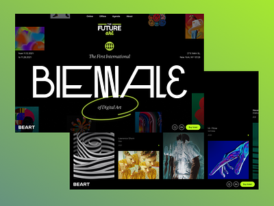
One more sick concept here. This is the site of a digital art exhibition. It's a gallery where you can dive into the digital world and see digital works in their native environment. How did we achieve this? With 3D, of course. But that's a topic for the next post with interactions.
And today we're going to talk about the style we've chosen. We were inspired by the glow of neon signs and brutal typography: mix of the rethinking old and the strange new. Experiments with letters, sharp as our time object edges. This is our feel and vision of digital future.
So what do you think about this style? Let us know in comments and press "L" if you're in love with our choice!
In next weeks we will show some interactions from this design. So follow us to stay tuned ⚡️
Made in Sick.
Follow us:


