Branding | Intrasquad - Logo Construction
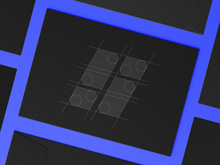
The symbol for Intrasquad is crafted in a meticulous way.
We used a set of lines and circles to come up with a shape that resembles the letter "S". This is the first letter of the word "Squad" and this was one of their main focus points. They really wanted to focus on the people that they work with and elevate their worth. But the symbol also resembles "Pips", the lines that go up and down in a chart to again make that connection between the brand and whet they do.
To read the full case, go to: https://bit.ly/3FUgBOU
