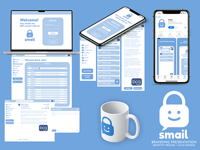
SMAIL - IDENTITY DESIGN / UI/UX DESIGN
BRIEF
“Smail” is a 100% secure email service with the goal of offering people a more genuine experience of receiving mail.
Note: Note: “Smail” isn’t a real company. The brief is taken from an online community called “The Spot”, which offers monthly challenges, similar to this one.
CONCEPT
The logo represents a symbol of privacy, a lock, with a smiley face on it (Smail = smile). The body of the lock is also a message bubble. The logo is meant to be friendly, playful and suggestive, whilst also showcasing responsability, through the use of the color blue.
I wanted to stay away from the cliche mail icon, used by most email services in their logo. Therefore, I went with the message bubble.
More by Alexandru Baciu View profile
Like
