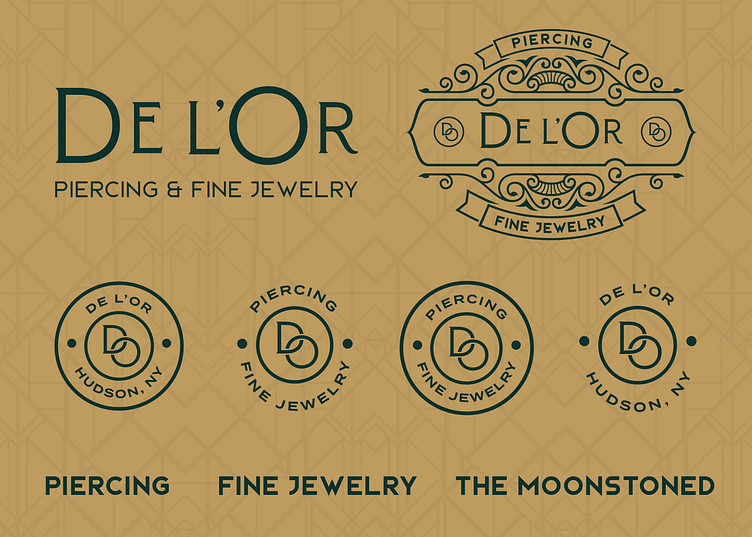
De l'Or Branding Kit
Here is a deeper dive into the branding kit for De l'Or
In french De l'Or means roughly means gold. When I first started designing this logo I was using a capital "L"This was a problem though... in french putting the emphasis on the "L" actually turns this into a masculine word and completely threw the logo out of context!
Although we came up with some great treatments that seemed to make the most sense for English readers, we decided to scrap the monogram and wordmark in order to adjust them accordingly.
I loved the "DL" monogram I created but doing the right thing ended up delivering an even better result! The "DO" shown above represents the business more as it naturally takes on the shape of a piercing which is one of the main offerings of the business!
This is just another reminder and reassurance that taking the time to get things right can really pay off #eckerdesignco
