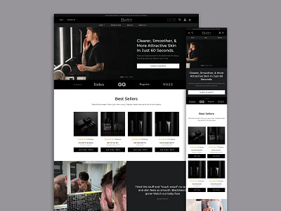
Bettr Homepage
The homepage is what will ultimately welcome customers to Bettr’s website, therefore the customers are greeted with the dark color palette that emphasizes the masculine theme throughout the brand and product. The products are also initially highlighted on the homepage to get straight to the point. Images are used to highlight people using the product and Bettr’s Instagram account is integrated to the homepage to display even more images of the products and products usage.
View Full Case Study: https://huemor.rocks/case-studies/bettr/
More by Huemor 🚀 View profile
Like
