EBP
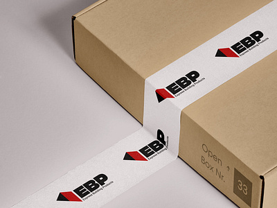
Our talented designers have been hard at work on a variety of branding projects this week, including this primary logo design for the building supplies business, EBP!
Express Building Products (EBP) visual identity cements itself deeply into its target market - construction and building sites. We did this by utilising a two-tone structure symbol that creates a 3/4 view of a building.
This element can be used throughout the brand to break down white space and create interesting visuals. The colours we used for EBP have a high contrast which creates an eye-catching look. We used red, which symbolises bold and 'action', which ties in very well with the company's ethos - fast and easy delivery of building products without needing to leave the site.
unbxd.co.uk
